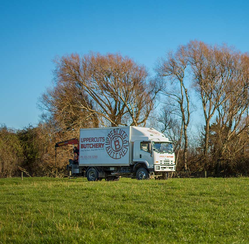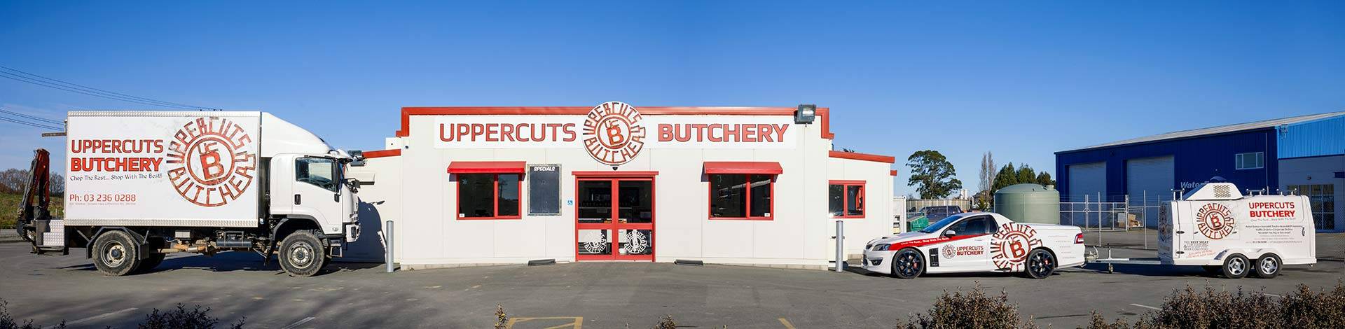
Uppercuts Butchery
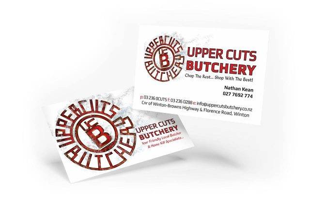
We began working with Uppercuts Butchery back in 2012. The initial project was a “Watch This Space” sign for the location of the new building. And the first stand-alone Butchery in Winton. From there we discussed the importance of creating a strong visual identity and the uppercuts logo – based on the idea of a branding iron – was born. Since then we have done a whole range of work together, from the logo, building signage, vehicle signage, brochures, letterhead, business cards and website to name a few.
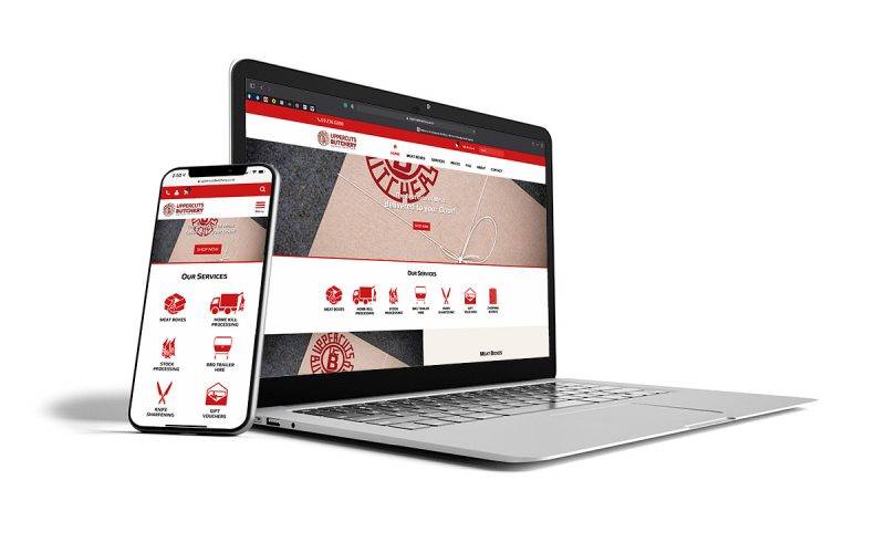
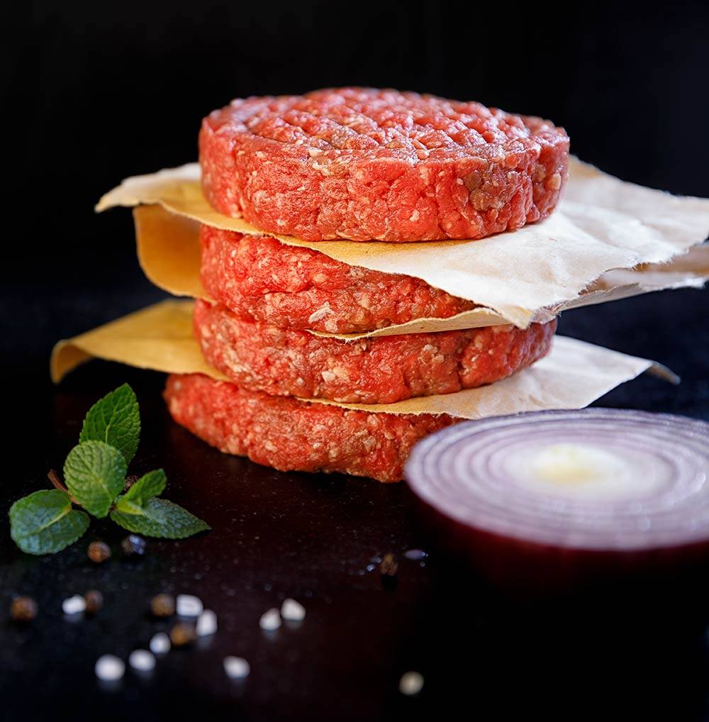
We also helped with the meat box launch. We created a strategy after revamping their website and they went to work setting it in motion.
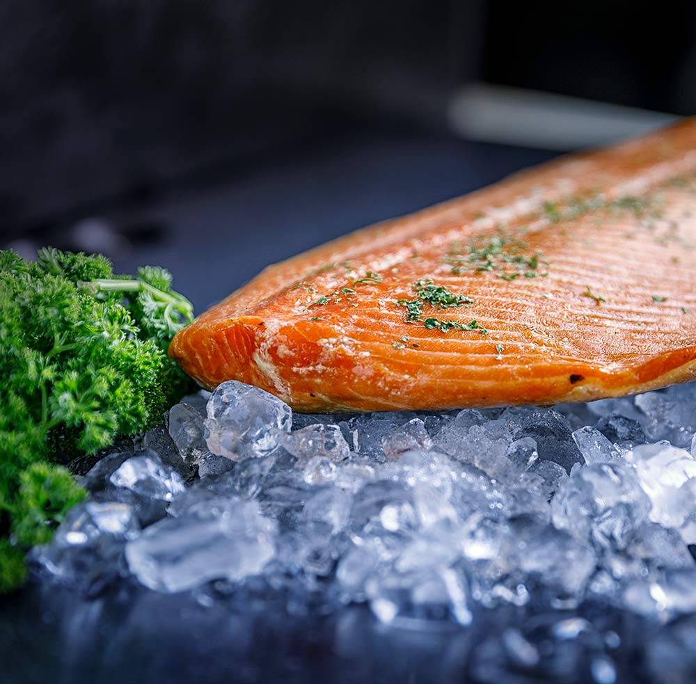
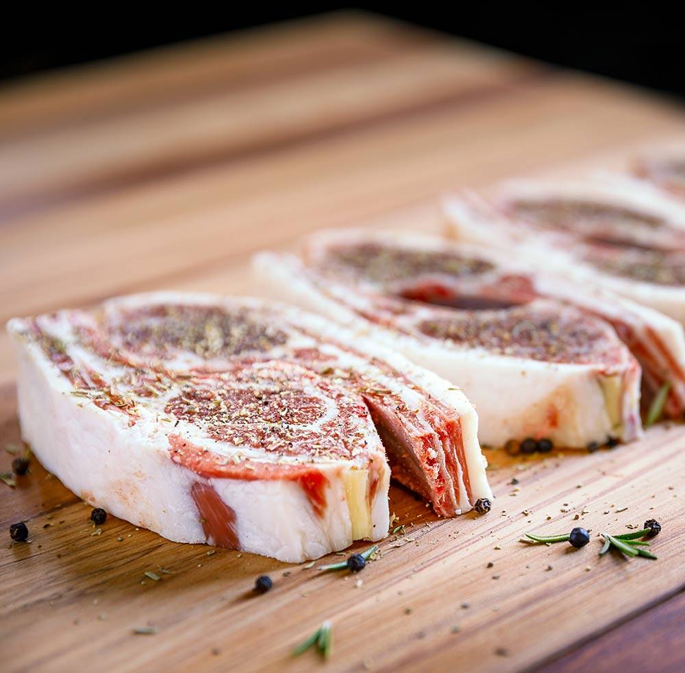
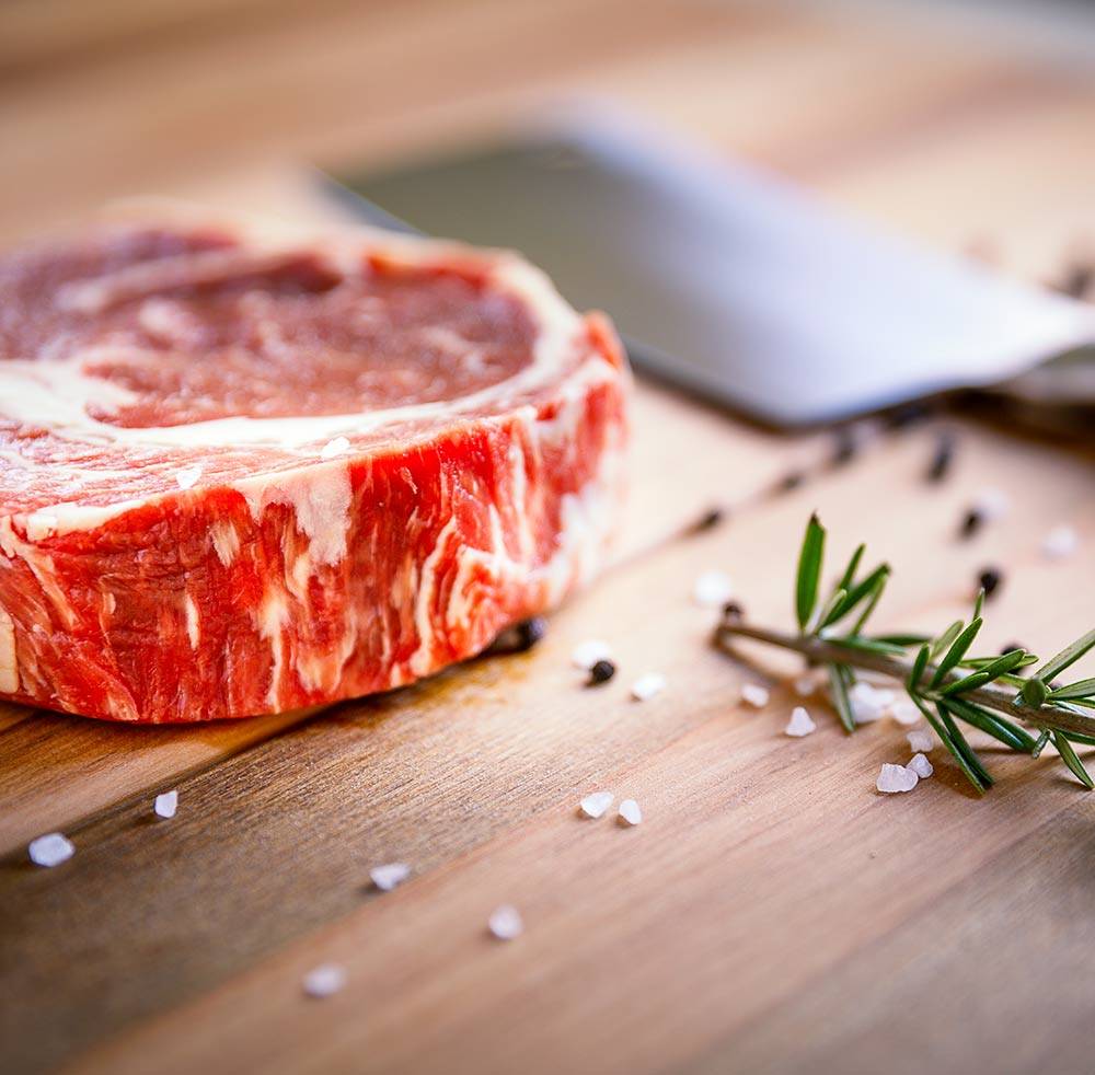
Uppercuts Butchery wanted to provide tender, amazing meat, but wanted to show their personality too. They thought a bit of irreverence represented them best. So the meat boxes have names like “Keto Meato”, “Uppercut the Carbs”, and “Ham on the bone”.
It’s fair to say that ‘meating’ Uppercuts Butchery was and has been an amazing experience for us. Not only are Nathan and Robyn are amazing people, but the end product is awesome too… We’re happy to say everything they are doing is well done – except the steak… Well done steak is terrible