Imagine
Design
Execute
Amplify
I.D.E.A
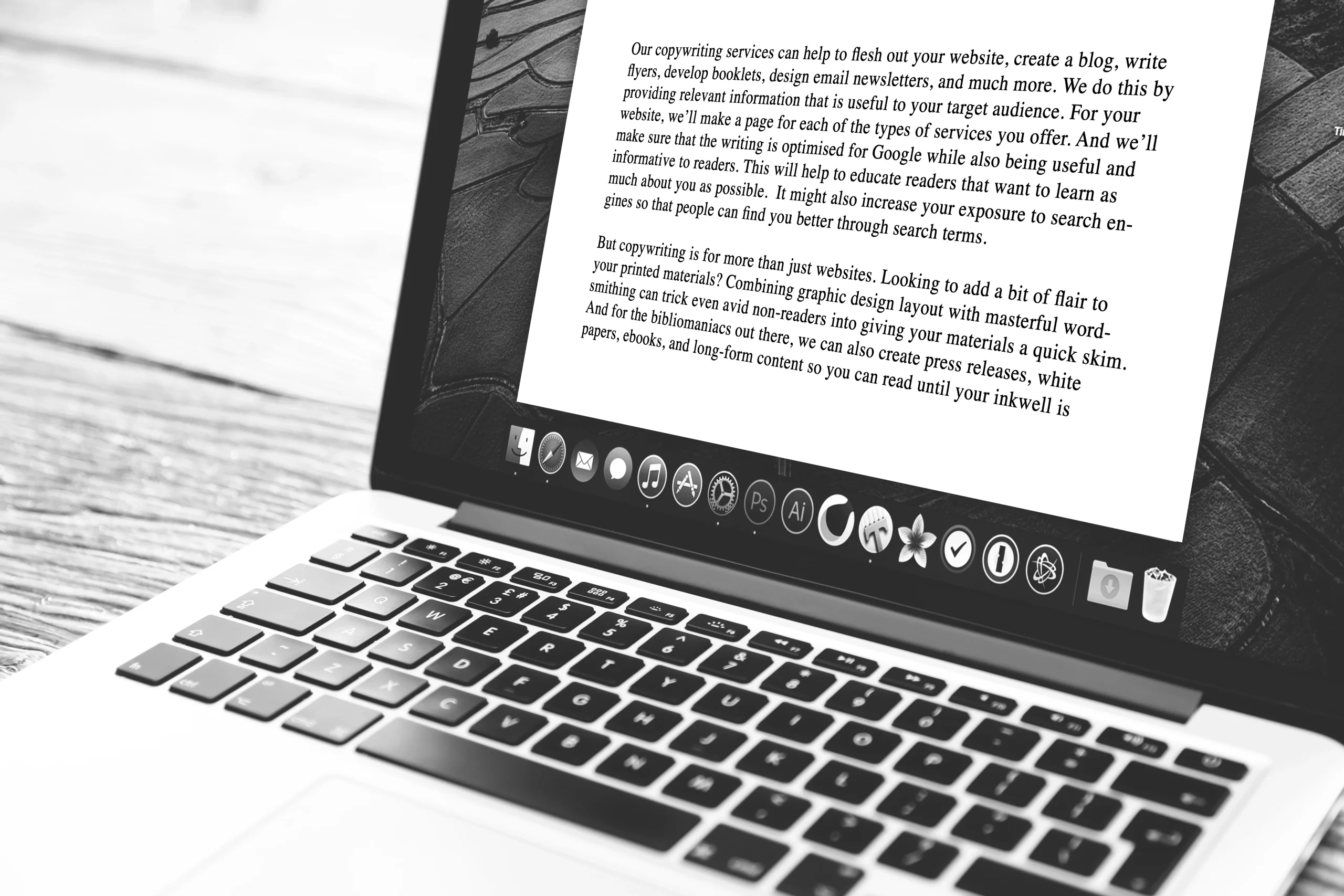
A Website is the Core of any Digital Marketing Strategy


Great Web Design is key, however it's just the tip of the iceberg
The real magic of web design lurks beneath the surface!
Launching a killer product or web design takes more than just an awesome idea, and that’s where I.D.E.A comes in. Our innovative framework will help you imagine, design, execute, and amplify your way to success. We even visualize it with an iceberg because, you know, hard work is like the hidden part beneath the surface. Sure, everyone sees the end product – but above all, that’s the tip of the iceberg. The real magic happens below the surface and in the 90% of the work that you won’t or can’t see – or understand (and that’s totally okay). Lucky for you it’s our jam…
And it’s also what will take your results to the next level and make your competitors jealous. So come join us and let’s make your ideas sail smoothly to success!
What can we do for you?
We partner with like-minded, ambitious business owners (like you) to create digitally driven website design solutions to help your business transform and grow.
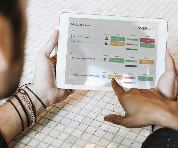
With the end goal in mind and WHY it’s important, let’s focus on the best way to execute the idea. Whether that be more visitors to your website or increasing your sales, understanding what drives your goal and defining the best course of action is ultimately what will get results.
The marketing services themselves are important, but working together in a partnership is what will see your business succeed.
Why Back9
Throughout our team we live by the belief that creative ideas are like dessert – there’s always room for more! With a design-led, user experience philosophy, the right marketing services, a solid plan, great design, and well-thought-out execution, we believe almost any marketing idea can be turned into something great. If you start with the WHY and stay true to your values and beliefs, everything else just falls into place.

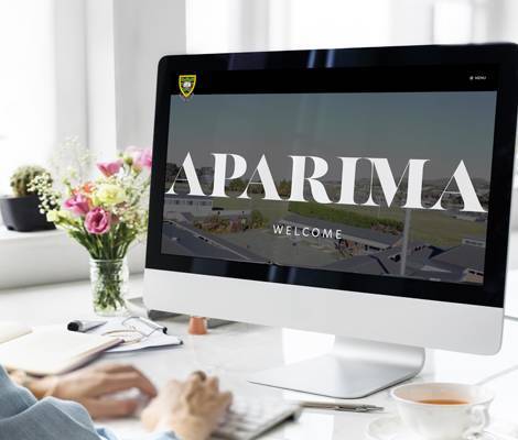
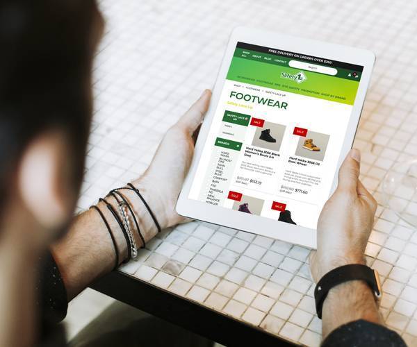


We've worked with
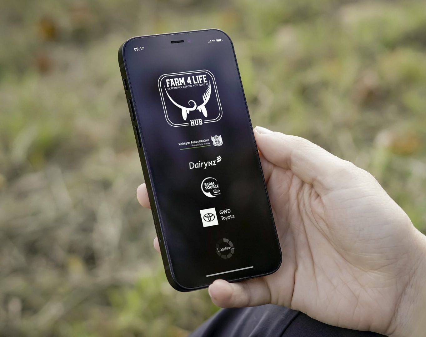
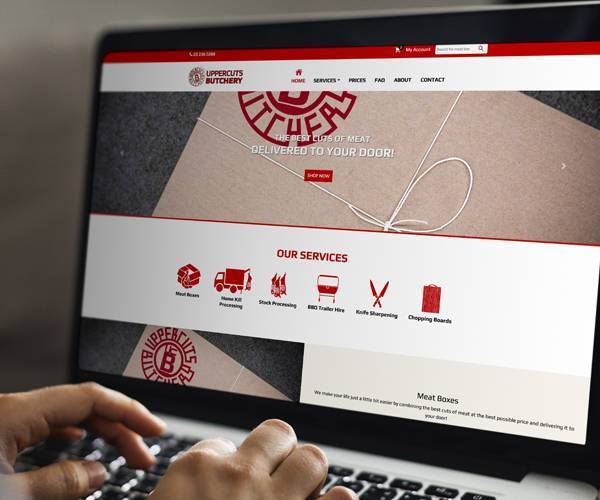
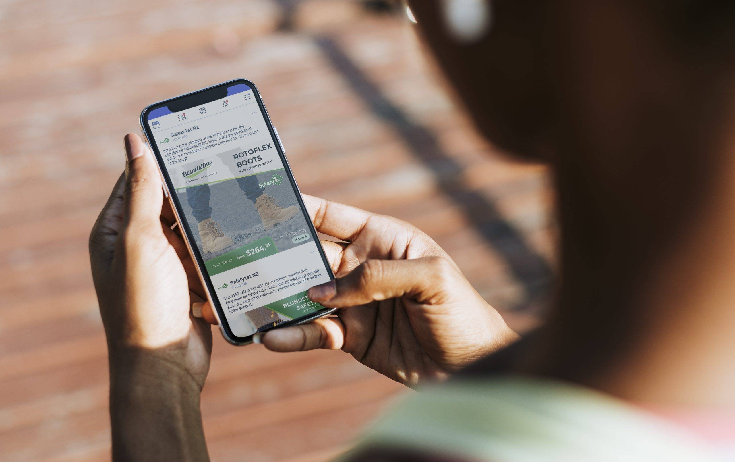
We are proud to have delivered exceptional work for amazing clients Southland and NZ wide.


From our studio...
We are big on ideas, and sharing them! Technology and trends are constantly changing so we’re constantly learning. Check out our thoughts on all things design, marketing, branding and more.

Staying out of the Spam Folder: Google’s Email Sender Requirements
April 23, 2024

What is the Google CMP Partnership program?
April 6, 2024

Expert Google Ads Management: Your Key to Efficient Ad Spend and Better Results
March 26, 2024
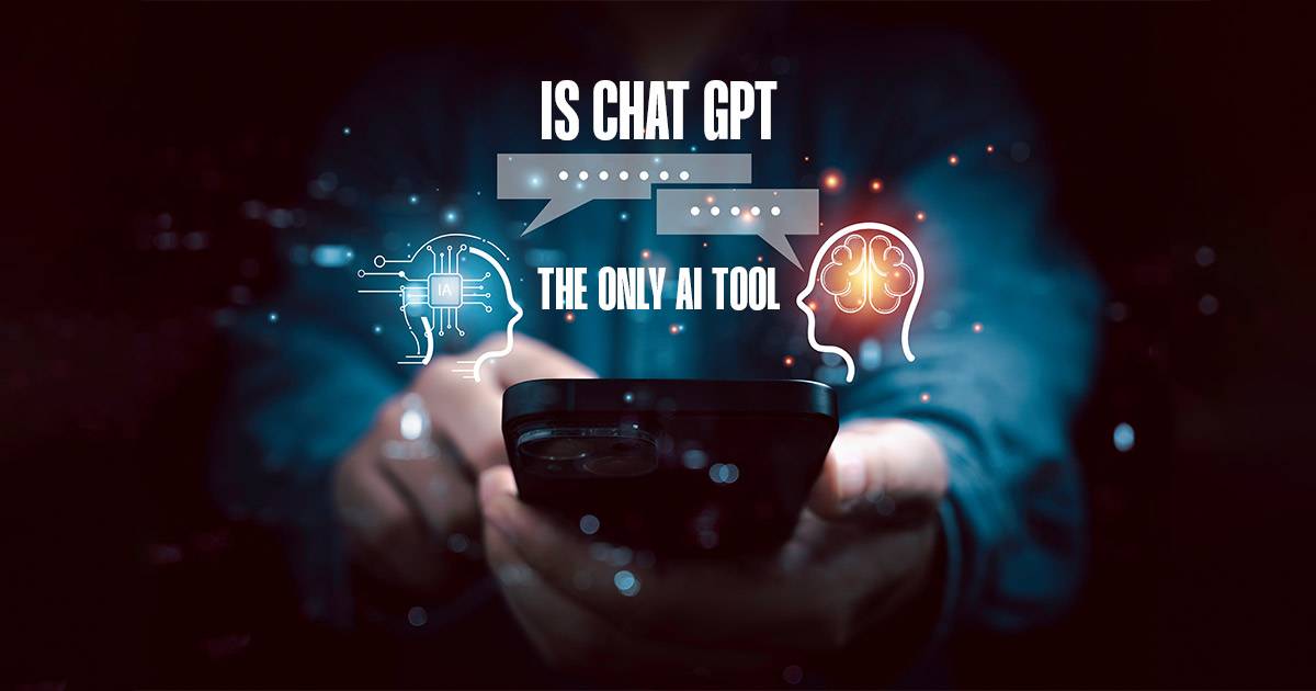
Chat GPT: The Wagon Wheel Effect
March 9, 2024

Third-Party Email Software Charges
March 3, 2024

Measuring the Success of a Marketing Campaign
February 22, 2024
Follow Us


1,639

Recently we welcomed Fawn Turton to our team. Well, to be fair It's almost been 4 whole weeks. Fawn is a bit of a wordsmith and loves creativity in marketing. She comes from a background in Marketing Management, Business Ownership/Entrepreneurship and Creative Freelancing, and she is a great all-round fit here at Back9.![]() Welcome Fawn!
Welcome Fawn!
www.back9.co.nz
Fawn (Turton) joins us with experience in Marketing Management, small business ownership and a passion for helping people reach their goals!
BASELINE TESTING INTRODUCTORY OFFER![]() Until the end of May come and get your baseline test for $45 (usually $60). Great time of year to get it done before the winter sport season. Send me a text or phone 021 444 629 to book (or via email vjdevery@gmail.com).
Until the end of May come and get your baseline test for $45 (usually $60). Great time of year to get it done before the winter sport season. Send me a text or phone 021 444 629 to book (or via email vjdevery@gmail.com).
This is awesome!! ![]() Congrats Maisy on your selection into the Wellington Phoenix Football Academy.
Congrats Maisy on your selection into the Wellington Phoenix Football Academy. ![]()
![]() Maisy was in the 16th Grade winning team from last year's Southland Tournament which we were proud to have been one pf the sponsors for.
Maisy was in the 16th Grade winning team from last year's Southland Tournament which we were proud to have been one pf the sponsors for. ![]() Best of Luck!
Best of Luck!![]() 💛🖤💛🖤
💛🖤💛🖤