Colour me Impressed! Why Colour in Design Matters
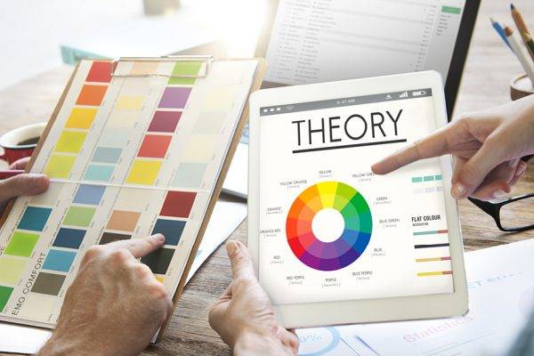
Everybody has a favourite colour, something that stands out and brings positive feelings. One theory is that individual humans perceive colour differently; so really, everyone’s favourite colour looks the same, but they call it something different (So everyone’s favourite colour is teal of course). But if we agree that most people see colour roughly the same way, we can agree that certain colours mesh while others clash. So how is colour used in design?
There’s a lot more to colour than simply matching well. Have you noticed that brands aiming to be high-end use colours like black and dark purple, while brands that want to show nature and health use greens and browns in their branding and logo? When choosing what colours to use for your brand, there’s a reason our designers don’t simply ask what your favourite colour is and translate it into hexadecimal colour code. Like font choice, colour also has meaning. And while the subconscious feelings behind colour might not be exactly the same for everyone, in general, colours give off specific feelings and meanings that are all considered when designing your brand.
Colour Coding
Colour science is a field of science that studies colours, how to apply colours through technology, and the effect of colour on thoughts and behaviour, and is even a Master’s Degree in the EU. While the correlation between colour and its effect on moods, imagery, and behaviours isn’t concrete or the same for everyone, in general, certain colours suggest certain features for many people, and colour choice is much more involved than simply what looks cool. So what do these colours typically represent and when is a good time to use them?
Red
Red is a colour of action. It represents passion and excitement, and creates a sense of urgency. The colour red has the potential to trigger more raw, powerful emotions–but can do so for both negative and positive ones, so should be used with caution.
Orange
A colour that ranks high for making products seem less expensive is orange. A bit more on the playful side, orange typically is suited for more fun or adventurous brands. It’s typically not ideal for formal, corporate ones. If used poorly, it can instead make a brand appear childish and immature.
Brown
Brown is earthy, the colour of tree bark in the forest and the ground beneath. It’s a solid choice for companies that want to look natural or organic. This feel is emphasised when combined with other earthy colours such as green. It’s often seen as an honest, trustworthy colour, but used badly can look dirty or unrefined.
Yellow
The colour of happiness and sunshine, yellow is youthful and vibrant. While it tends to have a lot of positive effects such as optimism and increasing sales, it’s difficult to use well due to contrast issues and being hard to read. Using a wrong shade in the wrong contest can also look unclean or smudgy.
Green
Choose green when going for something healthy and fresh. As the colour of grass and leaves, green has gained traction as being the colour of environmental friendliness. When used properly with food, it can show vitality and healthiness… And when done wrong, make people think of unpleasantness such as mould.
Blue
Blue is on the opposite end of the colour wheel to red, and has a calming, cool, feel. It’s often used as the colour of logic, reason, and wisdom. While it’s usually a safe choice, the conveyance of reason can make it feel cold, unfriendly, and emotionless.
Purple
For much of history, purple has been the colour of royalty, and thus still has an air of luxury to it. And, since royalty is “more elite” than non-royal, purple brings about feeling of sophistication and superiority. But, that can also become a negative if used improperly and can be seen as over-extravagant or elitist.
Pink
Pink is a great choice to show caring and gentleness. It exhibits youthfulness and represents hope and is a bold choice to help a brand stand out. But when used poorly, it’s more likely to look childish or needlessly rebellious.
Black
Used somewhere in a good portion fo designs, black shows power and luxury. Many high-end brands use black and white palettes to show sophistication and simplicity, that the product or service is good, plain and simple. Like blue, black can also show coldness or even heaviness and seem domineering when used poorly.
White
Often representing cleanliness and purity, white is used often by modern brands. Usually, white is the best colour for the background of a website so that attention isn’t drawn away from other elements. This means using white for branding requires using an offsetting background colour like white, and using it wrong can look boring, empty, and plain.
So remember that colour is complicated, and the meanings behind colour is just one of the many things our designers think about when designing your brand, website, and logo!


